“Data Visualization in PowerPoint: Turning Numbers into Impactful Graphics”
In the corporate world, effective communication of data is essential for decision-making and conveying insights. Microsoft PowerPoint, a widely used presentation software, offers powerful tools for transforming raw data into visually compelling graphics. This article explores techniques and best practices for data visualization in PowerPoint, allowing presenters to convey complex information in an engaging and easily understandable manner.
Body:
1. **Choose the Right Chart Type:**
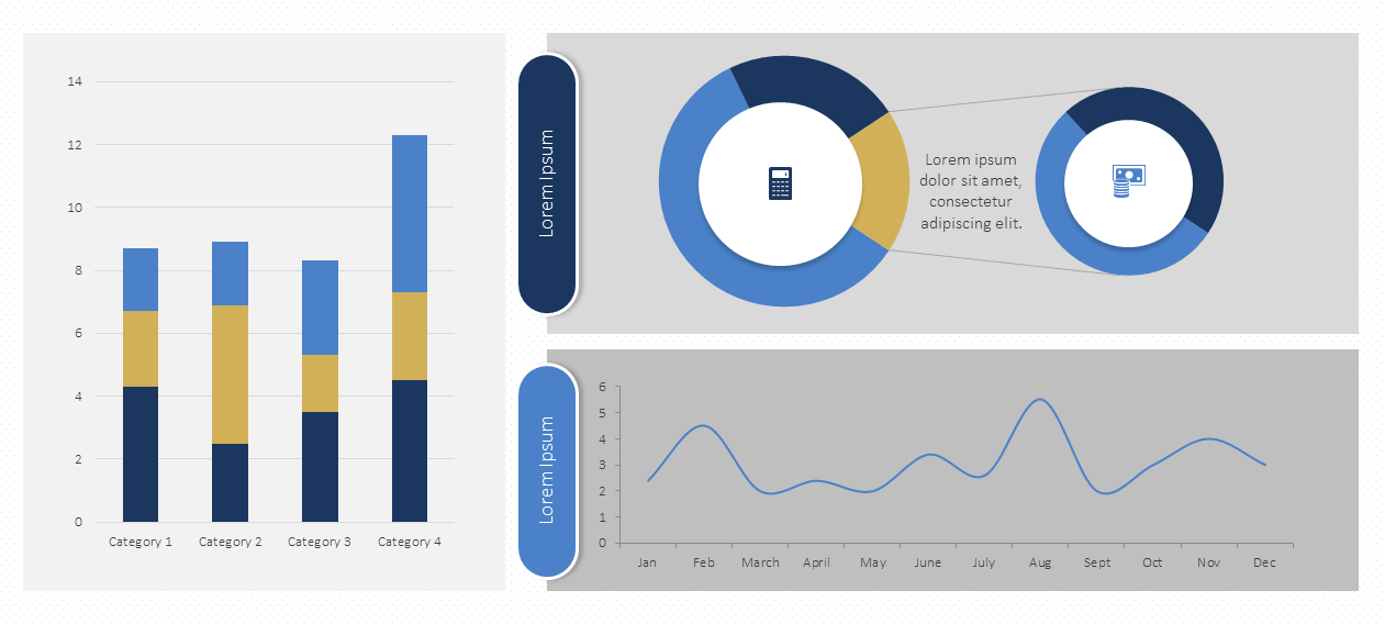
– Select a chart type that best suits the data and the message you want to convey. Common types include bar charts, line charts, pie charts, and scatter plots.
– Consider the audience and the nature of the data when deciding on the appropriate chart style for maximum impact.
2. **Simplify and Focus on Key Information:**
– Avoid overwhelming your audience with too much data. Simplify your charts to highlight the most critical information.
– Use clear labels, titles, and annotations to guide viewers and ensure they understand the key takeaways.
3. **Consistent Color Palette and Style:**
– Maintain a consistent color palette and style throughout your presentation. This ensures visual coherence and helps the audience connect related data points.
– Use color strategically to emphasize important elements and create a visually appealing design.
4. **Utilize SmartArt for Hierarchical Data:**
– When presenting hierarchical data or processes, leverage PowerPoint’s SmartArt feature. It allows for the creation of visually appealing diagrams, flowcharts, and organizational charts.
– Use SmartArt to represent relationships, sequences, or hierarchies in a clear and structured manner.
5. **Animate Data for Sequential Presentation:**
– Introduce animation to reveal data points sequentially, guiding the audience through the story you want to tell.
– Animate charts or individual elements to emphasize trends or specific data points, helping to maintain audience engagement.
6. **Incorporate Infographics for Impact:**
– Create custom infographics to present complex data in a visually appealing and easy-to-understand format.
– Infographics can combine charts, icons, and text to tell a compelling visual story. PowerPoint provides tools for creating customized shapes and images.
7. **Use Data Labels and Callouts:**
– Add data labels to your charts to provide context and clarity. Displaying values directly on the chart enhances comprehension.
– Incorporate callouts or annotations to highlight specific data points, trends, or outliers, providing additional insights to the audience.
8. **Interactive Elements with Hyperlinks:**
– Make your presentation more interactive by using hyperlinks. Link charts or elements to additional slides for in-depth analysis.
– Create navigation paths within your presentation, allowing the audience to explore specific data points based on their interests.
9. **Embed Live Data with Excel:**
– For dynamic data that frequently updates, embed live Excel charts or tables into your PowerPoint presentation.
– This ensures that your data visuals are always current, eliminating the need for manual updates before each presentation.
10. **Create Data-driven Maps:**
– PowerPoint allows the integration of maps to visualize geographical data. Utilize tools like Map Charts or third-party add-ins to represent location-based information.
– Highlight regional trends or variations through color-coding or graduated symbols on maps.
11. **Incorporate Trends and Forecasting:**
– Showcase trends and projections using trendlines and forecasting features available in PowerPoint charts.
– Clearly communicate the trajectory of data over time and make informed predictions based on historical patterns.
12. **Accessible Design for All Audiences:**
– Ensure your data visualizations are accessible to diverse audiences. Use high-contrast colors, provide alternative text for images, and consider the readability of text and labels.
– Test your presentation with different accessibility tools to ensure inclusivity.
Conclusion:
Effective data visualization in PowerPoint goes beyond presenting numbers; it transforms information into a compelling narrative. By leveraging the software’s features wisely, presenters can convey complex data in a visually impactful manner, making their presentations more engaging, informative, and memorable. Whether you’re delivering insights to stakeholders, team members, or clients, mastering data visualization in PowerPoint is a valuable skill for effective communication.